Hello everyone,
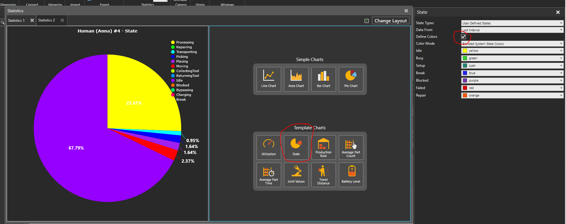
I am currently running into a problem with the statistics. I want the statistics (e.g. Bar or Pie Plot) to have my desired color scheme/colors.
Is there an easy way to change the colors? So far I only found out that the sequence of entering the signals has an influence.
Can this be solved by scripting? Or is their an easier way/a menu I missed?
I am using a pie chart, created from the statistics Tab. To have both graphs use the same colors, I could just repeat the creation process and change the sequence. But how do I generally just change the color I want to use?
E.g.: Breakdown red, Busy Green, Idle yellow and so on…
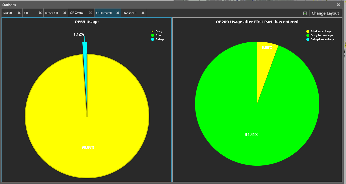
Example Picture:
Thanks everyone!