I use the statistics function and I have a question, so I leave a question.
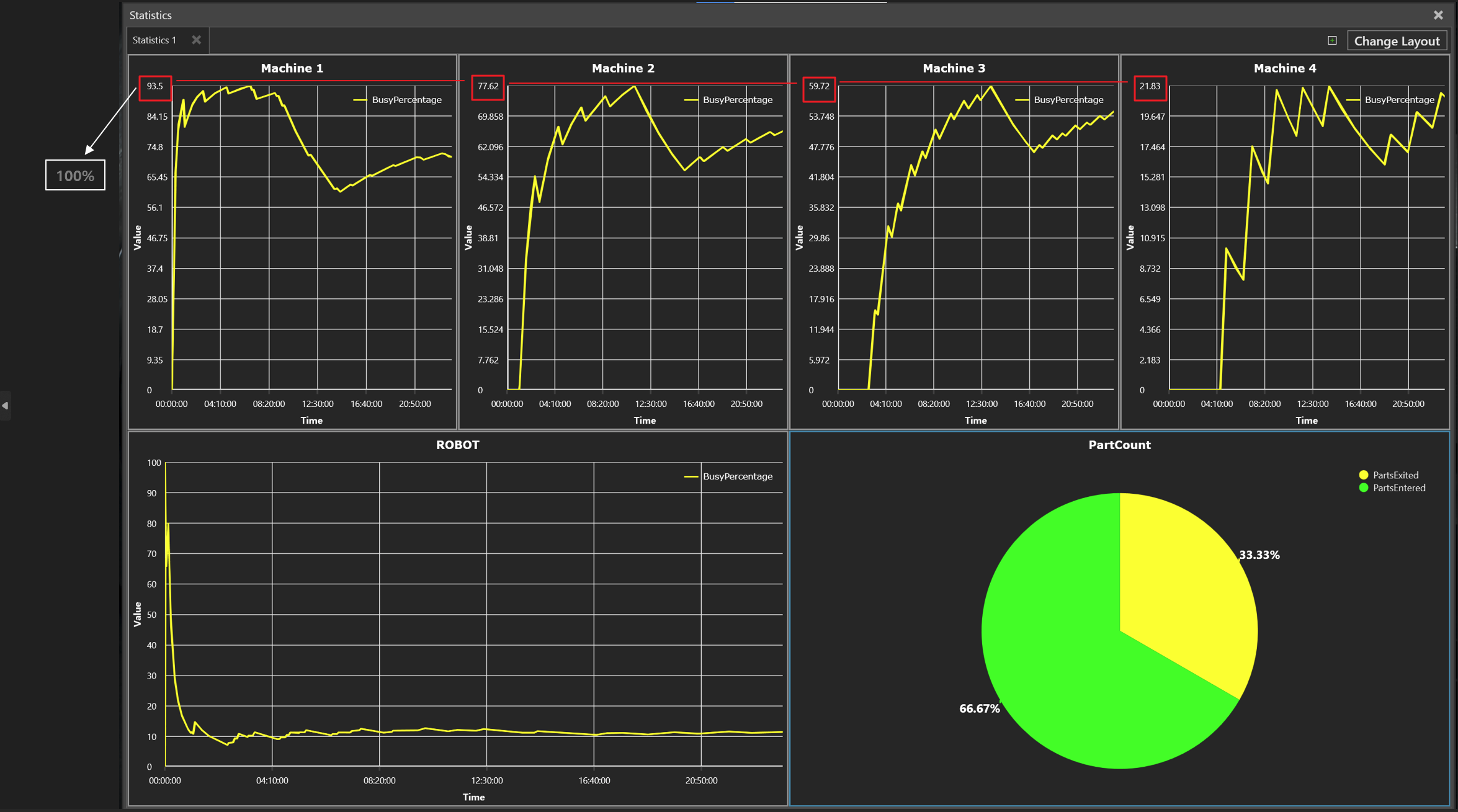
When multiple data were drawn, the chart showed that the maximum value was set to the maximum value of the scale.
Is there a way to see the maximum value of the scale based on 100% when trying to see statistics about the line chart?
Hi @JohnKim,
I don’t think it’s possible to change the scale of the chart. However you can export the data to e.g.: Excel format and visualize with Excels charts.
Alternatively you can add another set of data in your charts in their property panels. In it you track a property that stays constant at a value of 100. That way the chart axis must scale to 100.